What is a price chart and what can you do with it?
What is a price chart?
A price chart visually shows how the price of a financial instrument, such as fiat currency, crypto or a commodity, develops relative to another financial instrument. A price chart shows at a glance how the price has moved over time using lines, bars, or candles.
Within the chart, time is displayed on the horizontal axis (x-axis), while the vertical axis (y-axis) shows the price. This combination creates a clear overview of trends, such as increases, decreases, and periods of stability. Investors use price charts to gain insight into market behavior and to make better-informed decisions. Price charts therefore form the foundation for performing technical analysis.
Key Takeaways
- A price chart shows how the price of a financial instrument develops over time.
- The chart combines time (x-axis) and price (y-axis) to make trends and patterns visible.
- Investors use price charts as the basis for technical analysis and decision-making.
- There are different types of charts, such as line, bar, and candlestick charts, each with their own advantages.
- Candlestick charts are the most widely used because they display price movements in the clearest and most visual way.
How does a price chart work?
A price chart works by collecting historical price data and displaying it chronologically, for example through bar charts, line charts, or candlesticks. Each point on the chart represents a specific time period. In many price charts, you can set whether each point represents, for example, a minute, hour, day, or month. Within such a period, multiple price levels can be shown, such as the opening price, highest price, lowest price, and closing price.
In a candlestick chart: if a candle closes green, the closing price is higher than the opening price within that same period. If a candle closes red, the closing price is lower than the opening price.
Investors use price charts to identify patterns and potentially speculate on future price movements, such as upward and downward trends and possible turning points in the price. Price charts are also used to identify important price levels, such as support and resistance levels. For this, investors use technical indicators such as Moving Averages (MA) and Bollinger Bands (BB), which are based on price data.
How do you recognize a price chart?
You can recognize a price chart by several fixed characteristics. First, you will always see a time axis (horizontal) and a price scale (vertical). In addition, the chart consists of visual elements such as a line, bars, or candlesticks that represent price movements.
To make analyzing this data easier, visual aids such as colors are often added. For example, green and red candlesticks indicate whether the price has risen or fallen within a certain period. Timeframes can often be adjusted to, for example, a minute, hour, day, or month.
It is also often possible to add indicators to the price chart to perform technical analysis. Everything you see is designed to help investors recognize patterns and trends without having to focus on hard-to-read numbers.
Types of price charts
There are different types of price charts, each with its own way of visualizing prices. These are the most commonly used:
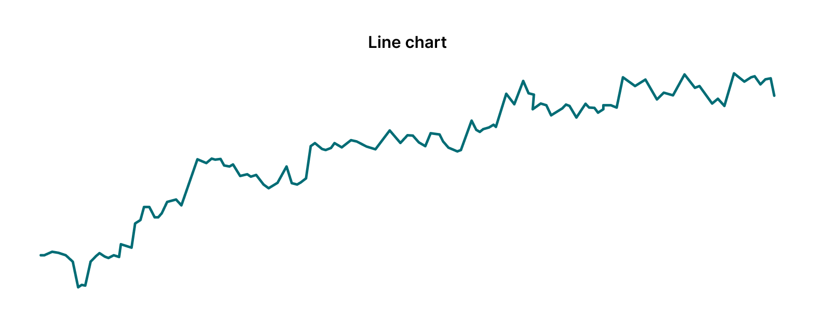
Line chart
A line chart connects closing prices into one continuous line. This is the simplest form of a price chart and is often used to get a general overview of price development.
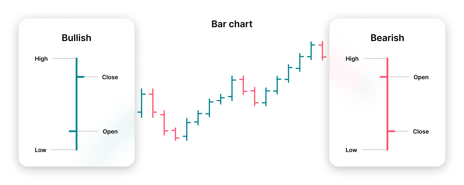
Bar chart
A bar chart shows the opening, highest, lowest, and closing price for each period. This is done with a vertical line (for high and low) and small ticks on the sides that indicate the opening and closing price.
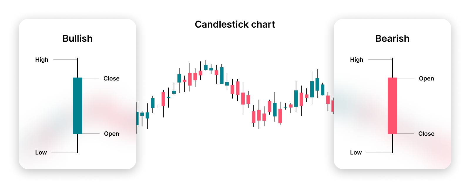
Candlestick chart
A candlestick chart shows the same data as a bar chart (open, high, low, and close), but in a clearer and more visual way. Each “candle” shows the difference between the opening and closing price with its colored body, and the highest and lowest price with thin lines. The color of the candle (for example green or red) immediately shows whether the price has increased or decreased. This makes a candlestick chart easier to read and very suitable for quickly recognizing patterns and market behavior.
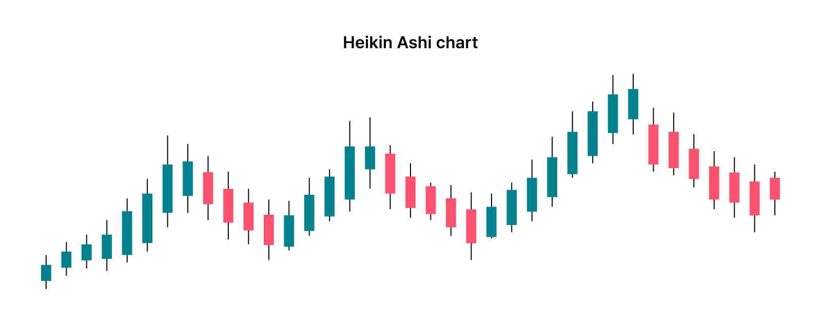
Heikin Ashi chart
This is an adapted form of the candlestick chart that uses average price values. This smooths out price movements, making trends easier to see.
Final thoughts
A price chart is an essential tool for anyone active in financial markets. By visually combining price and time, a price chart makes it possible to quickly gain insight into trends, patterns, and important price levels. Whether you are a beginner or an experienced investor, understanding price charts forms the basis for analyzing market behavior and making better-informed decisions.
Although all chart types use the same underlying data, the difference mainly lies in how this information is displayed. That is exactly why many investors choose candlestick charts, as they are the most intuitive and informative. At the same time, it remains important to realize that a price chart is only one part of a broader analysis. In combination with other indicators and insights, it becomes a truly powerful tool.